The Noblest Roman: A History of a Typeface


Readers of our spring print issue may recall Allison Meier's story on book designer and typographer Jerry Kelly, which touched briefly on his recently published chronicle of Centaur type, The Noblest Roman. Co-authored with Abbeville Press art director Misha Beletsky, the book explores Centaur's origins well as the life of its creator, Bruce Rogers (1870-1957). Originally published by the Book Club of California in 2016, a trade edition appeared this week from David R. Godine, himself a letterpress printer-turned-publisher.
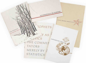
The Noblest Roman is itself physical proof of the enduring beauty and functionality of Centaur type and is set in three digital versions of the typeface; the main text is set in a revival of the original foundry Centaur, a new version is reserved for captions, and monotype Centaur sets off display text. An added treat is the tipped-in type specimen created with Monotype Centaur and Museum Centaur, newly cast from foundry mats that haven't been employed in one hundred years. Printed in four colors via offset lithography by Kelly, the whole endeavor makes for an immensely readable and elegant production. Just on face value alone, it is a typophile's delight.

An interior shot of The Noblest Roman. Reproduced with permission from David R. Godine.
The book traces Centaur's origins to the year 1470, when French printer and type designer Nicolas Jenson perfected the proportions and spacing of his namesake type. Jenson's type was hailed as "brilliant" and "more perfect in form than those of any previous printer." Fast forward five hundred years to William Morris' revival of Jenson's type, and subsequently, to Roger's perfection of the proportions to create the type employed regularly by institutions like Penguin Books and the Metropolitan Museum of Art. Kelly and Beletsky also tackle the near-mythical status of Rogers in the world of book design and how his mercurial personality has made credible biographical treatment challenging. The Noblest Roman draws on new research to create a nuanced portrait of this towering figure and includes sidebar biographies of fellow printers, designers, and punchcutters, rendering this a thorough history of typography and typographers of the twentieth century.
What made this style so groundbreaking in 1470 and so appealing in the twentieth century? More sculptural than calligraphic, Centaur still appears lively without too much flair that might otherwise distract a reader, while slight irregularities in the ties, terminals, and crossbars keep the typeface from becoming monotonous inkblots splashed across the page. Centaur has gracefully made the leap to digital media as well, where it is regularly employed for its readability.
The Noblest Roman was recently awarded the Mercantile Library Prize in American Bibliography, a cash award announced every three years. Previous winners include the American Antiquarian Society, Joseph Felcone, and Andrea Krupp. This year the award is split between The Noblest Roman and The Mythical Indies and Columbus' Apocalyptic Letter by Elizabeth Moore Willingham (Sussex Academic Press).
Though named after the title of the first book in which it appeared, Centaur is very much like its mythological namesake; a hybrid of styles that has undergone numerous incarnations, with sublime results. And though editors routinely discourage the use of absolutes, The Noblest Roman makes a most compelling case for this exquisite type.
The Noblest Roman, by Jerry Kelly and Misha Beletsky; David R. Godine, $45.00, 128 pages.