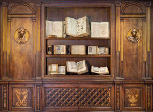


RRB: So, in this case, you’re looking at more than letters, you’re really looking at the print culture around these characters.
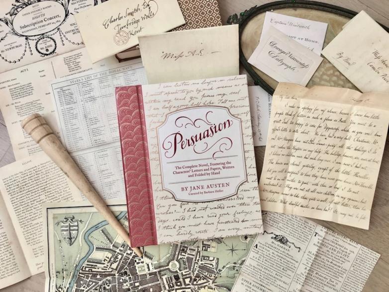
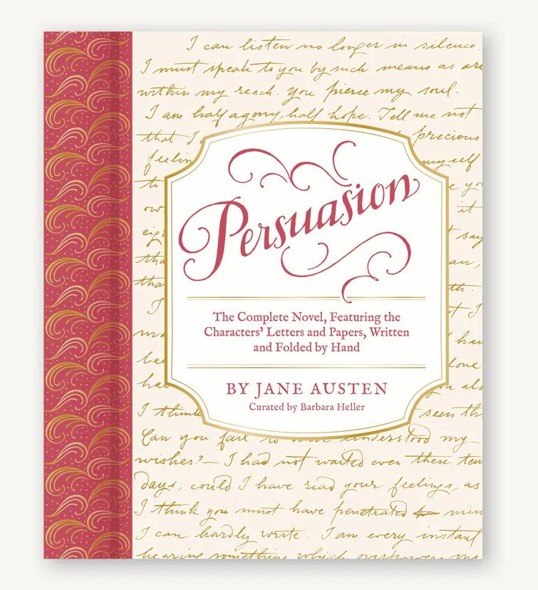
BH: Exactly. It's a lot more work because you have to research what every single item looked like, whereas with the letters, it was a huge learning curve in terms of how letters were written, what the postal marks were, how they were folded, but then it was the same pretty much for each one. For Persuasion, I had to find out about the calling card separately from the concert bill and then writing the entry for the baronetage — because Jane Austen only supplies one paragraph and an overview. That was a little scary, too. But, you know, fun scary.
RRB: You said before you held some of the original letters. Where did you go to do that?
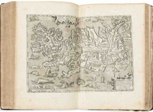
BH: For Pride & Prejudice, I did most of the research at the Morgan Library, where they have an enormous collection of letters written in England, in the very early 1800s. And the New York Public Library has letters as well. But then a postal historian who I found in England, was an enormous help in explaining all the postal marks and how they worked. There's a Postal Museum in London, and they were helpful too.
RRB: So when you decide, ‘I want to recreate this letter,’ do you then hire a calligrapher who you think is a good match for that particular project?
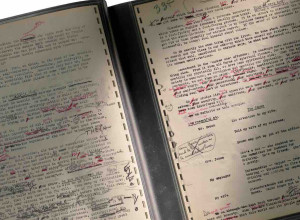
BH: Yes, the first thing I do is I research letters from the time to find handwriting that I think matches the character. Then find actual examples of letters that I feel could have been written by Captain Wentworth, or Mary Elliot Musgrove, or Mr. Collins, so that I have something to show a calligrapher so they can see what it is that I'm after. And then I work back and forth with the calligrapher. We just do tons of samples, looking at the ink color and the size of the writing, and is it pointy, is it angular? What is it about the sample that captures the essence of that character? Why is that particular handwriting right for Captain Wentworth? And then also, what kind of paper are they going to write on? Laid paper or rag paper, and the size, of course, is really important, too. And the color! The calligraphers do a million versions till we hit upon the one. I think we both feel it when it nails the handwriting and the emotion and the way it looks on the page.
RRB: It’s so much more involved than you would think!
BH: A lot of decisions are involved. And then I'm not even mentioning the graphic artist, Alexandra Morrill, who comes in and cleans things up. But I feel this obligation to Jane Austen and to Louisa May Alcott, and to the people who love those books, to have every bit of it tell as much about the character and their emotional state and further the story as possible. So everything I have to work with, I want it to be as telling as possible.
RRB: And historically accurate.
BH: Yes. It's very, very important. I have this voice in my head of some expert berating me if I feel like I stray.
RRB: What’s the biggest challenge with this kind of work?
BH: I think one of the hardest things is communicating what you want visually to someone else, to use words to describe what it is that you're after, even when you are being your most articulate and detailed, it's still always different than what you had pictured and sometimes better. But finding that working relationship where you understand what you are trying to achieve together, takes time.
RRB: Are you a calligrapher yourself?
BH: No, I have terrible handwriting. You would be so disappointed if my handwriting was Elizabeth Bennet’s!
RRB: It makes me think, there's all this brouhaha about cursive writing and whether we should teach it, whether people are learning it, and if people who are not learning it will be able to read historical documents or family documents. Was there any talk of that when you wanted to create these books?
BH: It never came up, and a friend of mine just sent me that article in the Atlantic Monthly. Did you see that? It was the former president of Harvard, and she was teaching a class and she assigned as a primary source Civil War letters, and half the class couldn't read them. And she was like, ‘how do you have a signature? How do you read a letter from a grandparent?’ I had never stopped to think about the fact that the audience for my books ... well, at least with the letters the text is printed in the book. So you have that, in a way it could be a primer for learning to read cursive.
RRB: Have you always been passionate about literature?
BH: Yes, I was an English major in college. And I've always been a big reader and I particularly love 19th-century British novels. I love Jane Eyre and David Copperfield.
RRB: You’ve also worked in film, I read?
BH: Yes, I work in film and TV as a set decorator. I find furnishings for the sets, so it's related. It's all about the character: what couch, chair, curtain would this character have chosen?
RRB: We did a story recently about the Dickinson show, basically about the set decorators and how everything had to be either an antique or a perfect facsimile, and all the work that went into doing that, and then how a large part of it then got donated to Harvard and the Emily Dickinson Museum.
BH: That's fascinating!
RRB: Can you say what you're working on next? Or if you're working on another special edition?
BH: I’m working on Anne of Green Gables.
RRB: Are there a lot of letters?
BH: There are three letters and there are things like the newspaper clipping that has the Pass List. There's some poetry and a program from the debating club. They're charming, more charming maybe then historical. I’d also love to do Sense & Sensibility. I haven't gone through it to see exactly how many letters or pieces of ephemera there are. But I do love that novel.